Houseful Brand
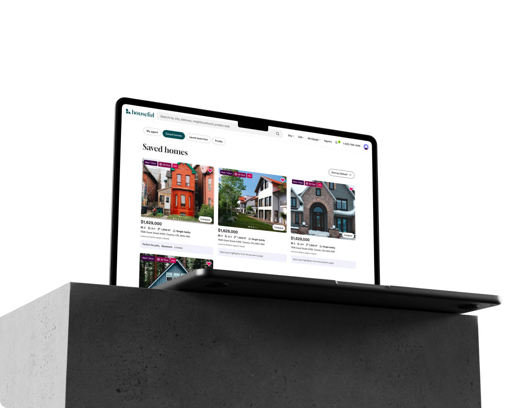
Early 2023, the Canadian arm of US-based real estate company, OJO, was acquired by the Royal Bank of Canada. Shortly after the acquisition, we (the in-house team) rebranded the company as Houseful, a natural first step in positioning the company in its new market.
Houseful is the homeowner’s ally, a trusted partner that sees them for who they are and provides individualized support to meet their unique needs. Houseful saw the fragmented and transactional state of the homebuying experience and sought to change it for the better.
The symbol is designed to achieve impact through simplicity — a form grounded and open, you may see the letter "h", a sunrise peeking through a doorway or window, or a multi-family high rise and two single family homes.
But in its simplest form, it is three shapes that come together to form one cohesive symbol. Like Houseful, where we are working to build a cohesive experience.
The identity itself is a reflection of our values. The colors reflect a positive and calm presence in contrast to a landscape that pressures you to make a massive decision quickly. The illustration style is a “flat-3D.” It depicts a lived in world with authentic spaces and scenes at home. Adding slight motion to the details of our illustrations can add to the humanity and lived in feel.
The identity is more than just a way to be recognized in the market, it’s a reflection of who Houseful is, which promotes being cohesive in different channels and in its storytelling.
Creative Director: Emma Cole
Sr. Brand Designer: Giulliano Chacha
Brand Designer: LeeAnn Lo
🏆 2024 Hermes Creative Awards Gold Winner, Company Branding
🏆 2024 MarCom Awards Gold Winner, Branding Refresh


